| Obituary Page | Prozine Artwork | Fanzine Artwork | Fanzines | Footnotes | Impossible Objects | History |

Harry Turner  – Impossible Object Designs 1

to Page 2  to Page 3
to Page 4  to Page 5

"My approach to impossible figures is pragmatic—I am more interested in the "how" than the "why" and "wherefore". I try to provide the reader with graphics of apparently concrete objects that can be handled and manipulated. This, I hope, gives assurance that the finished results have a commonsense credibility despite the visual anomalies that creep in.
   "I painted some designs based on optical illusions in the 1960s—ideas largely borrowed from Josef Albers. I knew of Escher's work at the time, and had read Arnheim, Gombrich and Gregory on art and illusions. But my active involvement was sparked off by the exhibition "Illusion in Art and Nature", at the Institute of Contemporary Art London, in 1973. The ICA held a competition for "new" illusion drawings: I sent in prints of "Odd Steps" and "Impossible Ziggurat" [see below], two variations on the "clevis" figure.
   "I played about with these ideas for some time after the exhibition. I eventually drew the "slab triad", which seemed a new departure [see the Zimri-7 cover design in Fanzine Art, page 2].
   "This idea of triads opened up a whole new world. I happened to be investigating Islamic geometric patterns at this time, and it became obvious that the designs based on regular triangular and hexagonal networks were linked to the isometric versions of impossible figures that I was producing.
     "In effect, I was drawing 3-D versions of flat Islamic patterns, and this realisation gave me the basis for a systematic approach to the subject — if you can represent a 3-D object on a 2-D isometric grid, then a drawing on the grid should be realisable as a solid.
   "When I received a request from Dover Publications, during 1976, to provide drawings for a children's colouring book, I suggested that the book would be more useful (and appeal to children of all ages) if text and diagrams were included, explaining how the designs originated, and enabling the reader to draw his own figures. Dover were enthusiastic and also commissioned a second book, dealing with the subject in greater depth, and concentrating on the use of triads as pattern generators.
   "However, I was having trouble with my eyesight, and when the first book was published in 1978, my vision had deteriorated so far that I began to find difficulty in carrying out the artwork and eventually had to abandon the second project. I was able to do little useful drawing and painting during the next few years, while undergoing a series of eye operations. Once my eyesight was restored, I became busy trying to make up for the period of enforced neglect!
   "I became aware of the work of Oscar Reutervaerd last year, when I saw his work on three Swedish stamps. So it's interesting to see more of his drawings and fill in on his background."
Extracts from a letter to Dr. Zenon Kulpa of the Institute of Biocybernetics and Biomedical Engineering, Warsaw, 11th January 1984
Impossible Ziggurat by Harry Turner, 1973Floating City by Harry Turner, 1974Odd Steps by Harry Turner, 1973
Impossible Ziggurat, 1973 / Floating City, 1974 / Odd Steps, 1973
The Ziggurat featured in The Penrose triangle and a family of related figures, a paper by Stephen W. Draper of the University of Sussex in Perception Vol. 7, 283-296 (1978)
Impossible Step Pyramid by Harry TurnerUndated draft of impossible object design
Space Construction by Harry Turner, 1974
Space Construction, 1974, ink on A3 card
Unstable Tower by Harry Turner, 1974
Unstable Tower, 1974, ink on A3 card
Sculptural Project by Harry Turner, 1974
Sculptural Project, 1974, ink on A3 card
The Triad uses the same general principle as the Penrose tribar for its effect, and in the versions based on rectangular prisms it resembles the Penrose tribar. But the Penrose figure has a visual 'wrongness' about it, an illogical twist that is unsettling, and proclaims its 'impossibleness'.
   The Triad, on the other hand, has a basic simplicity of assembly, a logicality about its construction; it doesn't shout out 'I am an illusion'. In an animation, three separate pieces can slide together to form the Triad shape, and be separated again without creating any visual incongruities. And the shapes can be drawn from two viewpoints to give impressions of the 'front' and 'back' of a particular combination.
   In a sense, it needs an intellectual appraisal of the final shape to appreciate the illogicality of the figure.
      A Triad figure drawn on an isometric network, can be surrounded by identical figures, and then extended in any direction to create an infinite pattern. The pattern-generating aspect of the triad has affinities with Islamic pattern construction.
   But where Islamic pattern tends to emphasise 'flatness', to repress the third dimension so that even an interlaced pattern is flattened, triad designs have an inherent hint of the third dimension about them, and refuse to be read as flat patterns.
   Enhancing this apparent solidity with tone or color reveals that triad patterns are paradoxical patterns indeed...
Impossible object design by Harry Turner, 1978Impossible object design by Harry Turner, 1980
Impossible object designs from an extended collection of types, 1978 & 1980

1978 Triad designs book by Harry Turner
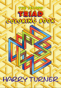
"Triad Optical Illusions and how to design them"
by Harry Turner, Dover Publications, 1978
2006 Triad colouring book by Harry Turner
Triad design colouring book by Harry Turner,
Dover Publications, 2006
Impossible Object transformation, 1976
Impossible object transformation, 1976:
an illustration for Martin Gardner's column in
Scientific American for November 1976
When Dover reissued the Triad design book as a colouring book (with the explanations and technical stuff removed) after a gap of almost 30 years, Harry Turner tried to interest them in a second volume of designs. But he failed to receive even the courtesy of a reply to his submission to Dover. 
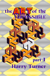
Eventually, as one of a series of tributes to the artist, a second collection of designs was published by Farrago Books in 2013.
The ART of the Impossible, a 2-part exploration of the full range of Harry Turner's impossible object designs, followed in 2019. (P.H.T.)

Letter to Ken Bulmer, April 1977

Dear Uncle Ken: sorry I missed you at the con. I was basking in the sunshine at Madeira at the time. It was an opportunity that came up at short notice that I grabbed with both hands (and held on to). As I was struggling to finish the text of a book, due to be published shortly by Dover Publications Inc. of New York, before I departed, the period before was hectic and confused!
   But it's all right now... I made the deadline, and this week I got the cheque (or check) for my efforts. So I'm in a bit of a daze: I feel more like framing this bit of paper and hanging it up among my trophies. On the other hand I look at all the outstanding bills and guess I'll be hurrying along to the bank with it next week.
   I believe you swept sentiment aside end steeled your heart and rejected one of Philip's novels recently. I think he's on with his fourth just now. Marion has been doing odd bits of writing and building up a steady sale as well as winning the odd competition here and I suppose it was high time that the old man joined in.
   You may faintly recall an article I did in Zimri a few years back, about drawing impossible objects and Iike that. I sent a copy to Howard P. Lyons (does the name ring bells in your memory?) since he and Pat religiously send me Christmas cards which I never seem to get around to answering in kind: so sending him the mag and a long letter was by way of easing my conscience.
   If you remember Howard, you may also remember that one of his hobies is conjuring. It just so happens that a fellow-amateur conjuror is Martin Gardner, who runs the mathematical recreations column in the Scientific American. So Howie sent him a copy of the article, and Martin writes to ask if I've any more impossible objects lurking in my files.
   So I send him a few samples and he promises to use them in his column sometime (which he did recently). Not only that, but a week or two later I get a letter from Dover asking if I'm interested in doing a colouring book—obviously Martin Gardner has dropped hints about this genius lurking unrecognised in the depths of the Cheshire countryside.
   Being the perfectionist I am, I suggested that more explanatory text should be included with the designs for colouring, and was asked to put up a proposal of of what I had in mind... and here it is due to be published in a few weeks time.

Letter to Harry Bell, 22 March 1978

Dear AZ:

I suppose the book stuff started as a Eureka-type accident as well as coming "from years of playing with these things". Come to think of it, I'm sure I sent you the original mag article I did that sparked the request for the book off, telling about looking for ideas for a painting and how I looked back over my scribbles and there was the original triad.

About four years or more ago. I didn't quite realise what I'd stumbled on at the time. The public I'm after? Well, children of all ages from 6 to 60, scientific artists and artistic scientists, people who like struggling with puzzles, folk interested in perceptual problems and paradoxes... Just think of all the art classes in schools and colleges all over the USA, all the art teachers looking for projects for their classes, projects that give them scope to guide and encourage experiment, all the kids screaming to be entertained on a rainy day... anyone interested in surface pattern and an easy foolproof way of generating new designs... don't they add up to a lot of people?

Enough to keep Dover happy, I guess!

So I reach a bigger audience—a receptive audience—with little effort compared with all the aggro of painting individual works and carting them round to exhibitions for a few people to gaze at.

Truth to tell, when I pick up a copy of the book and flick through the pages I find it hard to realise I did it. "Beautiful & fascinating" "Combines imagination with logical thinkingand ends up visually exciting", says Richard Gregory from the Brain and Perception Laboratory of Bristol University. "An interesting project" says Edward de Bono.

You see, I'm collecting all my blurbs for the next book already...

"Maurits Escher's graphics have Intrigued me for many years, and probably influenced me more than I perhaps realise. My first sight of his work was in an issue of the British art journal The Studio, which carried an article on wood engraving illustrated by Dream (1935), Three Spheres (1945), and Other World (1947). While I can't give the date of this issue, as I no longer have my files of this publication, it must have been between 1948 and 1950. Intrigued by his visions, I looked for other examples of his work, but there was little to be found here in Britain during the 50s.
   "I grew up with an interest in both the arts and sciences, at a time when they tended to be regarded as 'opposing' disciplines. I became an avid reader of science fiction, dreamed of space flight (and became involved with several astronautical societies), and drooled over books like Edwin Abbott's Flatland, with their visions of multi-dimensional universes and non-Euclidean geometries.
   "For a brief period, immediately before and after the war, I drew illustrations for several of the pioneer British sf magazines struggling to establish themselves before the genre achieved popularity.
   "I turned to easel painting. I found the work of the Russian Futurists and Constructivists, of the British Vorticists — Wyndham Lewis, Edward Wadsworth, C.W.R. Nevinson — to be of particular interest, although strangely neglected by contemporary art historians. For a while I painted geometric abstracts, mainly acrylics on canvas, with subjects that derived from mathematical concepts — dynamic symmetry and the geometries of form and growth, initially, then investigating 'dragon' and 'pathological' curves.
   "Whilst brooding over the illogicalities of 'space-filling' curves, sight of Albers' lithographs and engravings focussed my attention of perceptual ambiguities. And alongside these preoccupations, I began to investigate the magic of tessellation and pattern generation in Islamic geometrical art.
     "During this time I became aware of the extent of Escher's work, through many of the American mathematical texts I consulted in the 60s, whose authors proved to be great fans of Escher. And he kept appearing in Martin Gardner's column on mathematical games in the Scientific American.
   "My preoccupation with visual ambiguities was sharpened in 1973 by an exhibition held at the London Institute of Contemporary Arts 'Illusion in Nature and Art' (summarised in the book of the same title, edited by R.L. Gregory and E.H. Gombrich).
   "A side activity of this show was a competition for 'new' optical illusions... I was moved to send in some entries, and while making rough sketches I accidentally created something that seemed different (but too late for the competition, alas!).
   "Later, I played around with this shape, tidied up the results, and realised that I had drawn a figure in isometric projection — three identical shapes grouped round an equilateral triangle. I drew rectangular slabs originally but soon found that almost any isometric shap could be grouped as a triad, automatically creating an 'impossible figure'.
   "Grouping three triads together produced a more complex IF; extending the groups resulted in an infinite pattern of Islamic character. And in the Islamic manner, patterns could be varied by systematically changing the proportions of individual units and changing the manner of linking.
   "From the mid-60s there was a sudden popular interest in Escher's works English editions of American books were in all the bookshops, and prints of his work seemed to go up everywhere.
   "It was a revelation to catch up with Escher's Alhambra researches, to read his articles and notes on the regular division of the plane, and to study the graphic work he had produced on this aspect."
Extracts from a letter to Sabine Weber, a postgraduate student writing a thesis on the work of M.C. Escher, 20th February 1991
Further information on Escher and other experimenters in the field of impossible objects, including Harry Turner, can be found at the Impossible World website
Impossible Object by Harry Turner
Impossible Object design included in the doctoral thesis on M.C. Escher of Sabine Lepsky (geb. Weber)
Guided Tour by Harry Turner
Guided Tour, "Constructivist Baroque" with lay figure
Impossible artwork by Harry Turner, 1991
Impossible artwork, 1991

Rediscovered Impossible object designs by Harry Turner
"Came across some mislaid pics taken in '79, and was amused at the apparent
3D quality of drawings being examined. Fairly leap up from the paper..." H.T.

Interdimensional Traffic Control by Harry Turner, 1976
"Interdimensional Traffic Control" (1976)
pen & ink on paper, used in Banana Wings #10
(C. Brialey, M. Plummer) & Krax #41 (Andy Robson)
Game For Two Consenting Astronauts (1990) by Harry Turner
"Game For Two Consenting Astronauts" (1990)
pen & ink on paper
1992 Impossible object design with space theme by Harry Turner
1992 Impossible object design with space theme,
pen & ink on paper, back cover illo for
STET #9 (David & Leah Smith)
The artist at work by Harry Turner, 1990
The artist at work on a piece of impossible sculpture,
1990, pen & ink on paper, used in Krax #41
(Andy Robson)
1995 Impossible object design featuring Skel (or Eton) by Harry Turner
1995 Impossible object design featuring Skel (or Eton),
pen & ink on paper, used as back cover of Terrible
Work
#6 (1996), front cover of Krax #37 (2000)
1995 Impossible object design featuring Skel, Eton and a friend by Harry Turner
1995 Impossible object design featuring Skel,
Eton and a friend, pen & ink on paper, used as
interior illo for Terrible Work #6 (1996)
Further impossible object design from the 1990s,
pen & ink on paper
centre column: Monkey Puzzle

Impossible object design by Harry Turner, 1990

Monkey Puzzle by Harry Turner The Leonardo Fan Foundation, design by Harry Turner
The Proceedings of the The Leonardo Fan Foundation (1993)

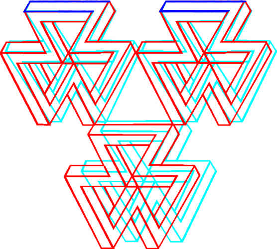
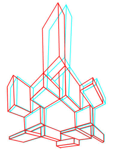
3D Triad designs inspired by Harry Turner's correspondence with fellow impossible object creator Diego Uribe of Buenos Aires, Argentina.
The designs work with both red/blue and red/green 3D glasses. With the red filter over the left eye, the designs appear to rise out
of the plane of the screen and they appear to dive into the plane of the screen with the red filter over the right eye.

Triad designs by H. Turner, 3D effects added by P. Turner

to page top© RFV&SDS, MM20.email address to contact