  A Technical Briefing A Technical Briefing  
The basic format of an Argentist painting includes a theme stated in silver (aluminium paint) surrounded by visual and other forms of complexity. The complexity is achieved in several ways: by underpainting, by creating a matrix of strong acrylic colours around and/or beneath the silver theme object, by introducing paradoxes and by deliberate deception.
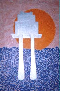 Painting 1. Sea Maze 44 x 67 cm Painting 1. Sea Maze 44 x 67 cm
Base medium: hardboard. Base paint coat: white household undercoat. Pink: Poppy household gloss mixed with white undercoat. Coeruleum blue and cadmium orange acrylic. Goodlass aluminium paint. Humbrol black enamel.
Visual complexity of the underpainting was achieved by using varying densities of pink. The area above the blue field was repainted later with deeper shades of pink for greater contrast. More subtle variations of shade may be seen behind the blue field on close examination.
The theme, an oil platform adapted and scaled up from a Shell advertisement, was outlined in black and given a three-dimensional effect with orange shading. The original concept for the maze was a formal, geometrical structure of concentric circles with radial walls in turqouise. At execution, however, the design was changed to a flowing, irregular pattern, partly to eliminate tedious construction before painting, partly to add a strong element of visual complexity, and partly, if unconsciously at the time, to reflect the shifting nature of the sea, which the blue field represents. Neat coeruleum blue was selected to provide a strong colour clash with the pink base. As it appears on the painting, it is a night-sky-blue rather than the lighter shade of a daytime sky. Painting the maze was an extremely long job, taking approximately 35 hours. Repeated overpainting added texture to the theme image and gave the orange sun-shape the desired opacity.
This first painting of the sequence was completed relatively rapidly as the design evolved. It embodies the spirit and the concepts of the Argentist School, and it remains a source of satisfaction and pleasure years after it was completed.
The visual complexity works at various ranges, and the silver itself provides a further level. According to the angle of viewing, the oil platform varies from a bright reflection to a deep, night-time grey. This third level of visual complexity was not anticipated at the time of construction. It provides a serendipitous extension of the original aims.
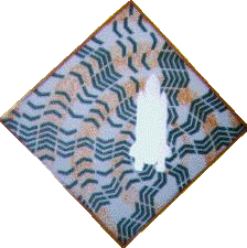 Painting 2. Chevronacht Painting 2. Chevronacht
37 cm diamond
Base medium: hardboard. Base paint coat: white household undercoat. Chromium oxide and cadmium orange acrylic. Goodlass aluminium paint. Humbrol black enamel.
A flat base was applied without underpainting and a Space Shuttle outline added in black, right of centre, to a diamond format. The chevron design was inspired by a type 6 Printed Postage Impression. The chevrons were applied via a cardboard stencil, which was rotated about a pin placed at the extreme right of the right-hand solid booster (hole still visible).
The design reached a completed but unsatisfactory state after about two weeks. Initially, the chevrons were arranged in neat, radial bands, with one extra chevron at each outward level. Later, the artist hit on the idea of achieving visual complexity by the use of 'flying chevrons' in the left side of the picture; a chaos of forming and disintegrating chevron stacks. Then came an orange spiral to damp down the white of the background as the final touch.
The second painting of the sequence had a long and difficult evolution. It hung on the wall, unframed, for about eighteen months awaiting inspiration between the initial surge of creativity and repainting of both background and chevrons to accommodate the 'flying chevron' idea. The orange spiral was added just before completion with an orange frame. It is less effective than Sea Maze in expressing the aims of the Argentist concept but it works in its own way after a difficult genesis.
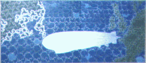 Painting 3. LZ-127 75 x 33 cm Painting 3. LZ-127 75 x 33 cm
Base medium: hardboard. Base paint coat: white household undercoat. Coeruleum blue, chromium oxide and cadmium orange acrylic. Goodlass aluminium paint. Humbrol black enamel. Designer's gouache permanent white.
A return to visual complexity in the underpainting was achieved by smearing drops of black gloss on the white base with a toothbrush. When dry, the black areas were toned down with a light overcoat of white in places.
The coastal outlines were taken from an atlas by tracing, supplying a grid and transferring the outline to a grid on the painting. The elements for the repeat patterns of the land masses were created by M.C. Esher. The repeat pattern for the North American continent was applied with strict regularity while the one for the European mainland was allowed to become distorted in the south. This repeat pattern was begun from the position of Friedrichshafen on the Boden-See; the location of the European Zeppelin base. The North American pattern is centred on Lakehurst, New Jersey, the Zeppelin base on the other side of the Atlantic. The basic unit for the American pattern is larger than the European base unit because everything is supposed to be bigger in the U.S. of A.
The same technique was used for the Zeppelin outline as for the map; a tracing of a photograph of the Graf Zeppelin was transferred via the grid system.
Another of M.C. Esher's designs provided the top line of birds and fish in the ocean area. Extrapolating the idea to provide variety in the interlocking designs and to fill the sea area took about one week. Initially, the designs were drawn through from a tracing. Then a variety of stencils provided new shapes.
Once the sea and land designs were completed, the picture became too dark. This was alleviated by toning down the underpainting in the gaps between the repeat pattern shapes using a scalpel. The final result hints at a cloud effect; either dark clouds on a light base or vice versa.
Silvering of the Zeppelin shape was taken to a stage which allowed the black ribs to show through. The silvering was then extended to a border around every green shape in contact with the sea. As an interesting spin-off, it illustrates how little of the British Isles is any great distance from the sea.
The base design was more or less completed after three weeks. Silvering, and adding second coats of blue and green to achieve satisfactory opacity, took a further three weeks. The painting hung on the wall, unframed, for about eighteen months in this condition. Then the question of signing arose when the frame was ready. A fish in the bottom right corner was lightened with a mixture of coeruleum blue and process white to make a green signature visible. The idea was extended across the painting to highlight other shapes.
Painting 3 is as satisfying as Painting 1 as an illustration of Argentist principles. It is also the most complex in construction and required an enormous amount of work and thought to reach completion. The extensive silvering gives it many moods according to the lighting conditions. The coastal silvering tends to become one with the underpainting from certain angles, and leaps out only when seen from the correct angle. Every element of the picture contributes to its visual complexity.
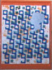 Painting 4. V-9.2 27 x 21 cm Painting 4. V-9.2 27 x 21 cm
Base medium: hardboard. Base paint coat: white household undercoat. Hot Sahara household gloss. Coeruleum blue and chromium oxide acrylic. Permenent white gouache. Goodlass aluminium paint.
The underpainting involved a variation of the techniques used in the previous painting. Drops of Hot Sahara on the base coat were softened by dotting with a piece of flexible plastic foam to give an irregular distribution of shade and position. A stencil of a figure 9 was made from scrap plastic. It was used to create interlocking rows of the figure 96, starting at the top left, each lower row shifted half of one unit to the right.
As the two dark colours tended to merge at a distance, it was decided to vary the shade of the green filling in the 6s and the junctions of the loops and tails, while keeping the blue of the 9s constant. The effect is to highlight the 6s in some areas and the 9s in others. A recorded 75 minutes to paint 14.5 figure 9s gives an average figure of about five minutes for each figure per coat of paint. The silver figure is a silhouette of Queen Victoria from the 1840s.
The visual complexity of this fourth Argentist painting exists on many levels. As well as the standard components of underpainting and the shades of green, plus the moods of the silhouette according to lighting conditions, the complexity exists within the picture itself.
It has the format of a commemorative stamp, but Queen Victoria's head was never used as a modern, metallic silhouette. The design appears to be interlocking 96s, but as it bleeds to the edges, the 6s disappear. They are but holes in the design actually painted. The painting is open to both interpretation and explanation.
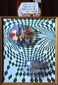 Painting 5. Holy Zarqon's What? Painting 5. Holy Zarqon's What?
30 x 24 cm base, 3-Dimensional
Base medium: hardboard. Base paint coat: white household undercoat. Chromium oxide and coeruleum blue acrylic. Goodlass aluminium paint. Silvered thread. Cutout newspaper pictures of sharks. Humbrol black enamel. Designer's gouache permanent white. Easter egg packaging.
A very simple underpainting technique was used: blue dots applied as a spray from a toothbrush. The design was based on p. 32 of Geometrical Designs & Optical Art by Jean Larcher with deliberately introduced asymmetry.
Filling in alternate shapes in the upper part of the picture showed up the form of the design. Leaving gaps in the lower part created visual complexity. In addition, one diamond shape has been filled in incorrectly deliberately.
The blisters are packaging from Easter eggs, secured by legs projecting through slots cut in the painting. The fish in the top blister are made from a cardboard Easter egg box. The sharks in the lower blister are newspaper pictures lightly coated with aluminium paint to allow the printing to show through. A plastic Trust Magazine mailing wrapper supports some of the fish, silver thread the rest.
Like the third painting, this one hung on the wall in a semi-finished state while final decisions were made on the extent of filling in green shapes in the lower part. Painting 5 combines op art - an apparent distortion of a flat surface by the use of an eye-twitching design - with a sculptural element via the blisters.
The title is derived from The Hitchhiker's Guide To The Galaxy by Douglas Adams - a reference to Holy Zarqon's Singing Fish! An oath used by the hitchhikers. Reflecting the wrongly painted diamond, the sign contains a deliberate grammatical mistake, extending the theme of complexity.
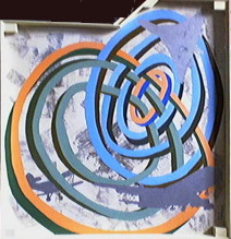 Painting 6. Scenes From Village Life 57 x (61) cm Painting 6. Scenes From Village Life 57 x (61) cm
Base medium: hardboard. Base paint coat: white household undercoat. Newspaper printing ink. Coeruleum blue, chromium oxide and cadmium orange acrylic. Goodlass aluminium paint. Humbrol black enamel. Designer's gouache permanent white. Clear wood varnish.
The design began as a sketch of interwoven rings on the back of an envelope. The scenes were applied by rubbing newspaper pictures from the back to donate the picture via an ink-transfer process. The ring shapes were applied via a stencil constructed from a large sheet of newspaper.
The Concorde silhouette was the initial theme image. The Boeing 747 was added on the grounds that the cutting had been lying around in a folder for many years and it was about time that it was used for something.
Colouring the rings began after about a fortnight, when the intersecting transfers and silhouettes were in position. The rings were to have dark sides and lighter tops, After some experimentation, the following colouring scheme was devised:
Triplet sides: outer - three parts green, no parts orange (pure green); next - two parts green, one part orange; next one part green, one part orange.
Quartet sides: inner - four blue, no orange; next - three blue, one orange; next - two blue, one orange; next - equal blue and orange.
The initial plan to silver the upper surfaces resulted in too much loss of detail and half-strength acrylic colour were used instead. The acrylics were mixed 1:1 with white gouache, green for the triplet and blue for the quartet. In addition, orange was used for the inner ring of the quartet and the outer ring of the triplet.
As a final, balancing touch, the Fairey Swordfish silhouette was added behind the rings in the bottom-left corner. After signature, the white areas were coated with clear varnish to protect the 'transfers'. When the frame was applied, the first name of the signature was found to be obscured by part of the frame. The first name was removed with a scalpel, repainted in its present position, and 8 further coats of varnish were applied.
The title of this sixth painting in the sequence reflects an original idea to use mainly pictures of buildings as transfers, It contains a large element of discovery through experiment, such as the vibrant quality of the half-strength blue and orange. Deducing the thinking behind the colour-progression of the sides of the rings requires some knowledge of how colours mix. To the non-artist, grey is not an obvious product of blue and orange, and blue or green mixed with orange produce a very similar shade of brown. As required by the Argentist Code, there is complexity on many levels.
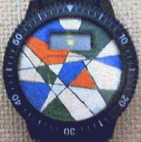 Painting 7. (Digital Watch Dial) Painting 7. (Digital Watch Dial)
35 x 25 mm
Base medium: plastic watch face. Base paint coat: permanent white gouache. Household undercoat. Coeruleum blue, chromium oxide and cadmium orange acrylic. Goodlass aluminium paint. Black ballpoint.
An irregular watch face was painted white with gouache, ruled with intersecting black lines, and appropriate shapes were coloured and silvered such that shapes of the same colour do not touch.
This was a quick alternative to the face on a cheap digital watch, which was painted with a set of redundant hands fixed at ten past ten. The present, decorative dial is relevant as the original, and may be hung on the wall with other Argentist designs when it is not gracing the owner's wrist, or when the battery runs out.
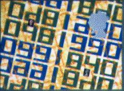 Painting 8. QV/QE 1840/1990 Painting 8. QV/QE 1840/1990
35.5 x 25.5 cm
Base coat: household yellow gloss on white undercoat. Coeruleum blue, chromiun oxide and cadmium orange acrylic. Goodlass aluminium paint. Postage stamps.
When the double-headed, Penny Black commemorative stamps were issued in January, 1990, it was obvious that there would have to be an Argentist variation of Painting 4 to mark the occasion. Painting 4 has a vertical format. Painting 8 has a contrasting horizontal format.
Reversing the normal technique of applying a base coat of white to a sheet of scrap hardboard, the pre-existing coat of yellow gloss paint on the hardboard was distressed with a sanding block and a scalpel to take it down to the undercoat to give a sgraffito effect. In fact, the yellow paint dust tinted the undercoat, but the target of reducing the strength of the yellow significantly was achieved.
The theme and variations on the two years were applied via newspaper stencils. Line 3 was painted first and all in green. Then came the decision to paint 1990 and its variations in blue. The 1990 on line 3 is darker than the others because it was overpainted on green instead of yellow/white. Three coats of blue and green gave satisfactory opacity.
Horizontal format postage stamps have a monarch's head 8 mm high on a 27 mm high picture, which is the equivalent of a 3-inch head on a 10-inch painting. By sheer good luck, there was a picture of the right size in The Guardian, which meant that a.direct transfer by tracing could be made instead of scaling by grid. Differential silvering created a boundary between the overlaid heads: smooth for QV, textured for QE.
The orange network was applied by newspaper stencil, held down with a collection of 1/2 p pieces, and a piece of flexible foam dipped in almost neat orange acrylic diluted slightly with water. The network is a 2525 repeat pattern, offset by one-half of a unit at each level.
Two postage stamps, one from 1840 and the other from 1990, completed the design.
This painting and Painting 4 share a common numerical theme. The main difference is that some of the numbers in Painting 8 have a significance, The 96 in Painting 4 merely gave an interesting, interlocking pattern. Similarly, the 2525 in Number 8 has no intrinsic significance; it merely created an interesting brickwork effect when applied in that way to add to the visual complexity.
As far as the postage stamps are concerned, the 'Penny Black' is not genuine. It was taken from an advertisement in The Listener, and it is a parallelogram rather than a square. The 1990 first class stamp is also a fake in that it is a genuine stamp taken from a book of four, but it has the two sets of perforations cut off to create an imperforate stamp. The Argentist philosophy continues to pile on complexity in many ways.
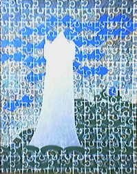 Painting 9. Castle Dracula 31.5 x 41 cm Painting 9. Castle Dracula 31.5 x 41 cm
Base coat: household yellow gloss on white undercoat with overlaid Humbrol black enamel. Coeruleum blue, chromium oxide and cadmium orange acrylic. Permanent white gouache. Goodlass aluminium paint.
This design harks back to Painting 3 in that it features an overall pattern behind the silvered figure. In this case, a jigsaw pattern, regular with areas of irregularity, was chosen; The painting has a vertical format.
Following the technique adopted for Painting 8, the pre-existing yellow gloss coat on a hardboard panel was distressed heavily with a scalpel blade to leave a predominantly white surface with areas of yellow. Smears of black were then applied, as for Painting 3, but very little of the black shows through in the final form.
The central, silvered figure was inspired by the picture of Pernstein Castle on the wartime stamps of Böhmen und Mähren, e.g. Michel catalogue No. 72. It was drawn freehand in black enamel, then silvered according to the usual practice.
Stencils cut from clear plastic were used to apply the other shapes. The jigsaw basic shape was applied as a sequence of units comprising the left side and the base. White paint was applied through the gaps in the stencil with either a pad of plastic foam or a brush. The internal areas around the central figure and the applied objects were filled in with a combination of a pointillist technique and sgraffito. The object was to create a relatively dense blue at the top left, a relatively dense green at the bottom right, a blush of orange around the bat figures and a distinct 'horizon glow' The general pattern for the jigsaw pieces is indented at left and top and with tabs at right and bottom. A variation with indents at left and right and tabs top and bottom runs diagonally from top left to lower right. There is a less disciplined area of irregularity in the mid-left region.
Painting 10.
This painting was made after the catalogue sweep which took in the first nine. Consequently, any information on it will have to be trawled from records made in 1992. At the moment, not even the title is known. The artist, when questioned about the detail of the painting, was singularly helpful: "Dunno, mate!" was about the best that he could do as a first effort. More later?
Well, yes, a bit more.
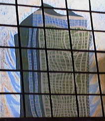 Painting 10 [Take 2]. A World In Flames 47 x 57 cm Painting 10 [Take 2]. A World In Flames 47 x 57 cm
Base coat: household white undercoat. Coeruleum blue, chromium oxide, cadmium orange and iridescent white acrylic. Permanent white gouache. Goodlass aluminium paint. Humbrol black enamel.
The painting has a vertical format and shows the distorted reflection of a skyscraper behind a non-rectilinear black grid. Cold flames surround the outline of the building. The artist recalls that painting the Vasarelly-distorted windows took a hell of a long time.
A picture will be included when someone locates the painting.
[Done - Ed.]
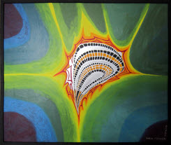 Painting 11/10. Aura 24" x 20" Painting 11/10. Aura 24" x 20"
Base coat: household white undercoat. Coeruleum blue, permanent rose, venetian red, cadmium yellow pale, cadmium yellow deep, black, and opaque chromium oxide acrylic. Goodlass aluminium paint.
The painting has a horizontal format and it is described as number eleven of a series of ten because of the gap of 26 years between the completion of number 10 and this work.
When asked what he was doing during the intervening years, the artist replied that he was transferring millions of words in typescript form (generated by his writing career during the previous 26 years) to an electronic form suitable for editing for publication on a PC, writing new novels, short stories and other literary pieces, creating escape fractal images on the PC, building websites and viewing spectacular migraine auras in the 1980s and, more recently, the somewhat less spectacular ones, which resumed in the second decade of the new millennium.
The escape fractals and the auras provided the inspiration for this painting.
|

